GREY
magical contamination
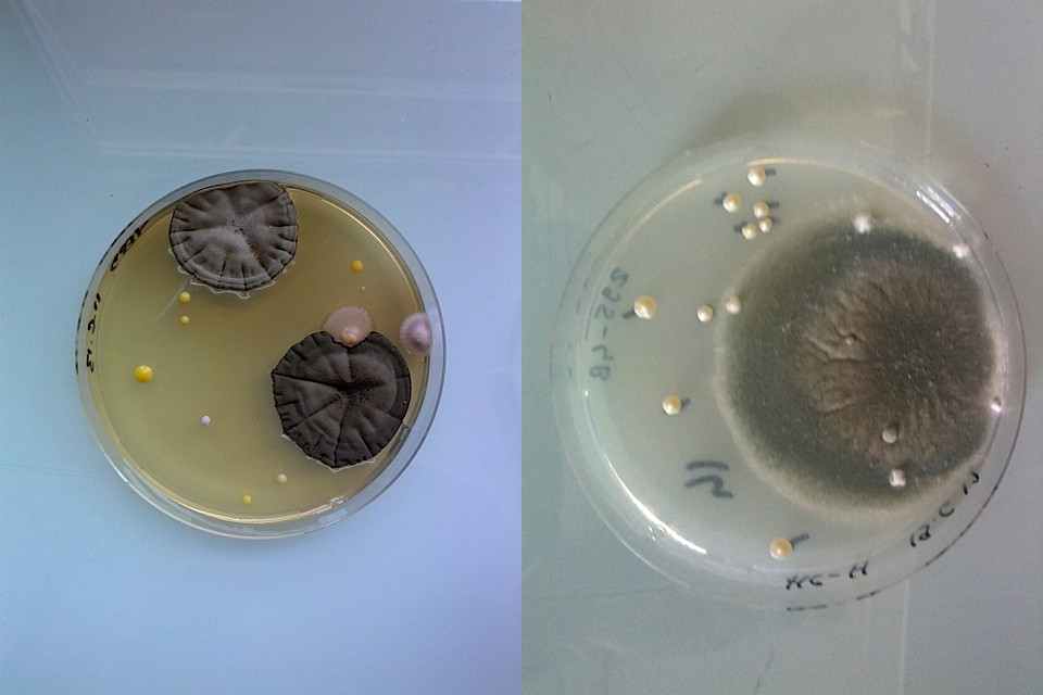
magical contamination by antoine bridier-nahmias
Grey is found everywhere: rocks, clouds, elephants, fishes, asphalt... As we have said before, it can reflect both softness and depression, and sometimes, as a natural phenomenon, it can be dreaded as it appears in little spots over a loaf of bread or on some innocent-looking raspberries.
In his tumblr Magical Contamination, Antoine Bridier-Nahmias turns his attention to this particularly occurrence – suddenly, under his attentive eye, those unwelcome microscopic mushrooms reveal their beauty and become strangely fascinating.
The greyness of the organic matter, sometimes disrupted by dashes of colour, creates organically grown compositions. The grey of blending and cross-fertilization (motifs that we have already come across in this section) is strongly present the petri dishes: it urges you to give in to the things you are not in control of, to accept nature and see how inherently magical it is. It pops out of nowhere within the city, your house, your fridge – in the same way it might have centuries ago – and at the same reminds us of our constant overconsumption.
Beyond the fusion of art and science, Antoine Bridier-Nahmias’ photographs underline a phenomenon that is both natural and universal – a greyness that occurs in all places and evokes in us suspicion and dread, or that can cause an unexpected, renewed sense of wonder and general curiosity.
Mathilde Leblond
Mathilde Leblond is a UK-based trendwatcher with a passion for creativity, beauty and the future. For Trend Tablet she contributes posts about some of the most arresting artists and creators which she scours the internet to find out about.
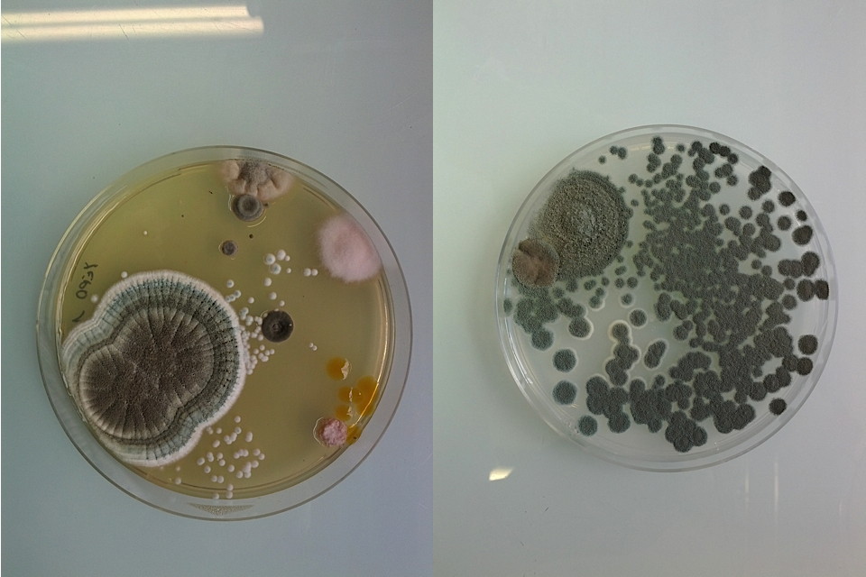
magical contamination by antoine bridier-nahmias
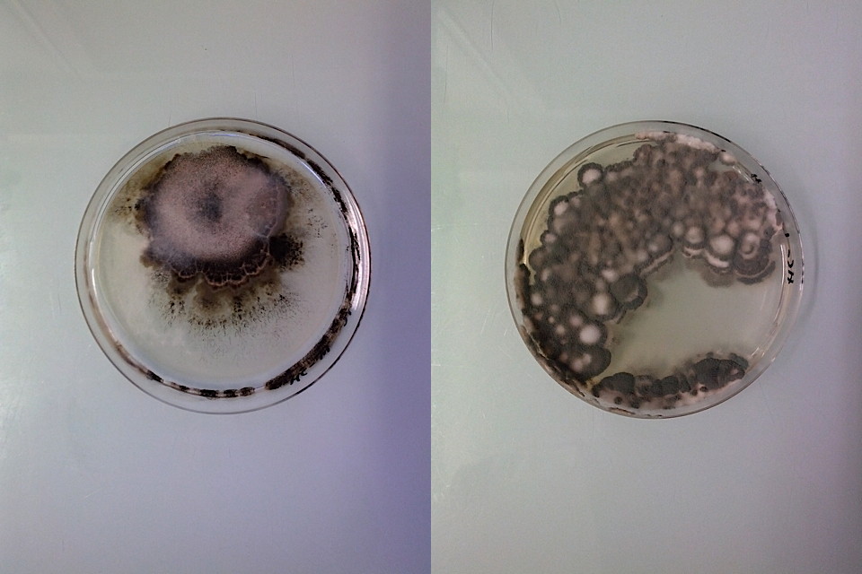
magical contamination by antoine bridier-nahmias
OSMOSIS the grey card of life

Spring-Summer 2008
To measure the strength of light a photographer is using a grey card to determine the value between dark and light. In the same way we need an instrument to measure our current mood and appreciation of society; are we indulging in serenity with light grey flooding in or are we burning bridges bringing the darker shades of ashes?
Are our greys pretty and picture perfect like the lustrous shining tones of pearls or urban and invisible like concrete poetry? Is your grey basic and boring or exotic and avant-garde? How grey are you? How grey are we?
Grey was going to be the shade of the 21st Century until mutual global aggression made us regress to black and white; the “you are with us or against us” rhetoric.
With a strong feeling of political, economic, ecological and humanistic failure, a growin need to go back to grey, to consensus, osmosis, blending and cross-fertilisation starts to invade the political arena, financial markets, social issues and our own families and households. A true need for consensus is felt. Or should I say an urge for consensus?

photo Philippe Munda
Therefore, I have been determined to make a colourcard only out of grey. To show howbeautiful the world can be between black and white, how rich in tone and how strong instatement. And how many variations of these greys exist, made by clouds and shadows andall other blended, fused and hybrid materials.
Grey is the symbolic colour of networking,sharing and open-ended enterprising. From fleece to oxford to colourwovens and two-tone patterns, textile is also looking for alliances: wool and silk, silk and cotton, cotton and lycra, lycra and acetate, acetate and nylon…
 photo Philippe Munda
 photo Paul Barbera
These grey silhouettes will move through life like shadows and clouds in a more anonymous way signalling the end of our fascination with the people press and reality TV. Modesty, anonymity and privacy are the new ideas for the time to come, co-ordinating, balancing, negotiating, exchanging, permuting and moderating are
the new terms which will be used to describe newer ways of democracy and a more contemporary form of business where growth will be defined not only by shareholders’ greed but by their ethical and ecological principles.
 photo Pierluigi Macor
 Live Wire.Machachi, 1998
With this tendency towards fused and muted hybrids, fabrics will be layered, textiles will be colourwoven and dye processes will provide lively surfaces, patterns are blurred and prints are sketches and dreams.
Never before have I felt such a need to express a trend as holistic and dominant.

Yet since “every cloud has a silver lining”, we will alternate bad and good news, male and female, urban and rural and therefore matte and shine. Coming to terms with reality.

As an afterthought, I designed several other accent colours to nourish our greys to flourish into gardens, parties, picnics, travels, safaris and rituals. They are discreet, washed and bleached to seamlessly blend into the main grey message; with only some acidic brights to highlight the urban grey environment and to bring a touch of folklore in neutral territory, just like flowers emerging like red-hot flames after a bushfire signalling hope and renewal.
Some people may think that these neutrals are ideal to dress in a light-hearted yet neutral way, whereas others will feel a sense of loss and even impending danger.
It may be clear that some of these trends forecast severe and natural disasters like draughts, floods, winds and quakes. We can only hope that we will be spared from the manmade one.
Li Edelkoort
Variations on greys
Young Parisian designer Juliette Hoffmann creates exclusively knit garments. From tightly woven jersey to sculptural knitting, her collection offers casual pieces that espouse the body’s shape, enveloping it like supple and sensual armour.
For winter 2011/12, we focus on these delicate, comforting materials in wool and cotton, that come in a variety of barely coloured grey, pastel green and beige tones.

Concept:Trend Union
pleated, elaborately worked and bared dresses produce an asymmetrical silhouette, comprised of airy knits and fabrics rustling in tones of faintly bluish pastels.

Concept:Trend Union
large, ultra sculpted and sleeveless vests design an elegant, futuristic silhouette. Medium grey highlights shapes and accentuates volumes. Knits are textured in neutral, greyish shades.

Concept:Trend Union
open work and chiné knits come in a variety of large, reassuring pullovers. Colours are very soft, imperceptibly nuanced and give the romantic, feminine silhouette a poetic feeling.

Concept:Trend Union
reminiscent of modern armour, sculpted and heavy knits create imposing jackets and headdresses. Our silhouette blends into these generous materials in soothing colours.
The grey president

Confirmation

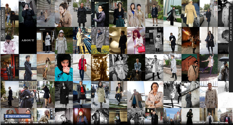
Art of the trench by Burberry
«Art of The Trench» shows everyday people wearing Burberry trench coats.
Photographers and trench coat owners are invited to participate to this experience.Users can comment on and share photos and the site is linked to Facebook Connect. The pictures can be browsed by smart categories such as : weather, colour, style... A great web 2.0 experience for a such an heritage brand.
Grey mania in N.Y.
grijs
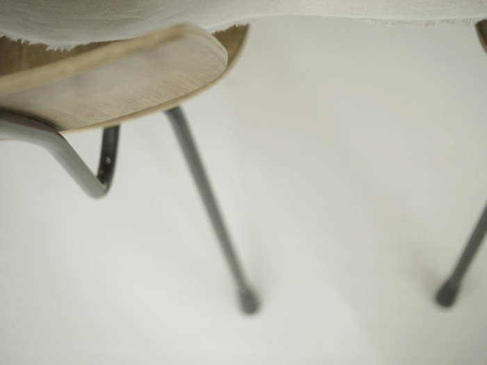
photo by grijs
". . . . I'm someone who is very passionate about the things we create
and how they are reflections of our brain , of who we are
In January 2007 i started grijs
a weblog on design , to share my passion for beauty
. . . . a number of events lead me to name my web space grijs
the most important one : a photograph in a newspaper the day after 9-11-2001
It was a picture of the collapsed twin towers seen from above in colour.
What fascinated me in that picture was how beautiful those colours were.
How they all blended into each other. To become one , but you could still retrace the different colors
+ I thought it was important to highlight the colour grey not just as a colour
but also as a concept , a way of thinking , to be subtle
The grey then was a mid grey , i've now moved on to a lighter grey
a grey that is almost transcendent.
This partly explains why i love grey
My guess is that sensory sensitive brains like these colors because they are
of low impact .
At least my brain feels at best surrounded by grey tones."
Loraine
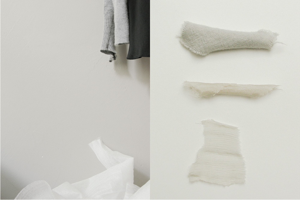
photo by grijs
2011-04-09 14:10:40

